Web Takes

Submit Your Entry to the 2021 eHealthcare Leadership Awards!

It’s May, and if you’re part of the digital healthcare marketing community, you know what that means… the Call for Entries for the 2021 eHealthcare Leadership Awards is officially open! What a year it has been. Last year around this time, we were hoping the worst was over and we could begin to get back Read More

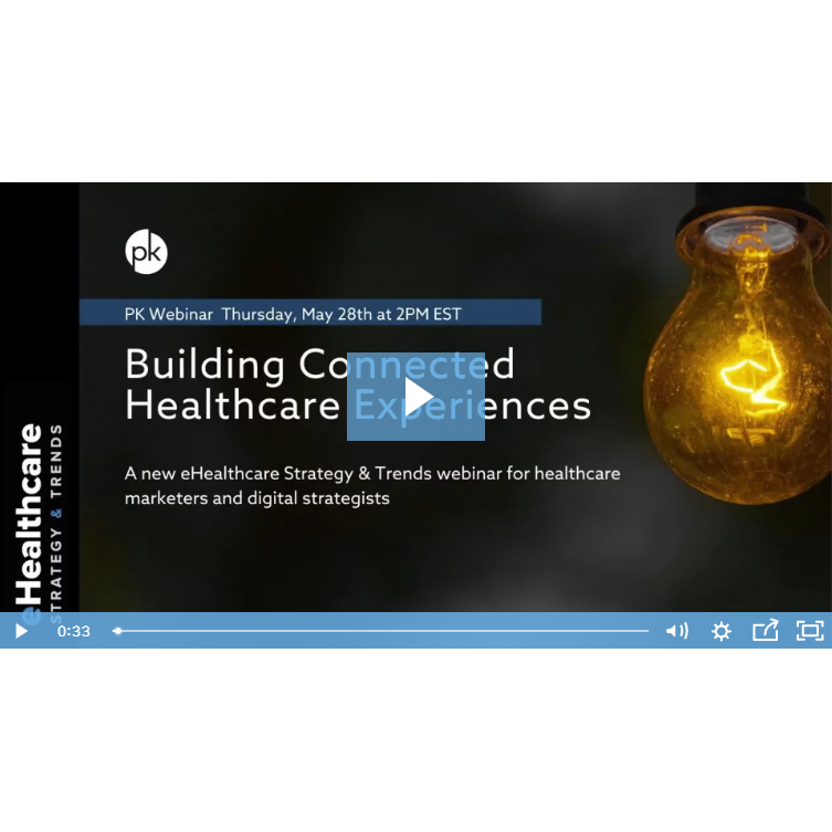
Building Connected Healthcare Experiences

eHST Webinar - Building Connected Healthcare Experiences

An eHealthcare Strategy & Trends webinar on demand for healthcare marketers and digital strategists. 

Your Presenters:

  • Jeff Cram, Partner, PK
  • Derek Philips, Director of Content Strategy, PK
  • Dave Wieneke, Healthcare Innovation Director, PK


Watch Now »

2018 eHealthcare Leadership Award Winners Announced

// By Jane Weber Brubaker // The eHealthcare Leadership Awards program recognizes the very best websites and digital communications efforts of a wide range of healthcare organizations. This year’s winners were announced November 7 at a special presentation in Scottsdale, Arizona during the Healthcare Internet Conference, produced by Greystone.Net. More than 200 organizations received recognition Read More

Call for Entries — 2018 eHealthcare Leadership Awards

eHealthcare Leadership Awards

The Call for Entries for the 2018 eHealthcare Leadership Awards is now open. This leading awards program, which draws some 1,000 entries, exclusively recognizes the very best websites and digital communications of healthcare organizations (both large and small), online health companies, pharmaceutical/medical equipment firms, agencies/suppliers, and business improvement initiatives. These awards highlight the role of Read More

2017 eHealthcare Leadership Award Winners Announced

eHealthcare Leadership Awards

Winners of the 2017 eHealthcare Leadership Awards were announced today at a special keynote presentation at the Healthcare Internet Conference in Austin, Texas. Over 200 organizations, representing a broad industry spectrum, received recognition for their outstanding websites and digital communications. A total of 116 individuals familiar with healthcare and the internet judged the entries. See Read More

Call for Entries — 2017 eHealthcare Leadership Awards

eHealthcare Leadership Awards Logo

This leading awards program, which drew over 900 entries last year, recognizes the very best websites and digital communications efforts of healthcare organizations, online health companies, pharmaceutical/medical equipment firms, suppliers, and business improvement initiatives. Now in its 18th year, the awards program is presented by Plain-English Health Care, publisher of eHealthcare Strategy & Trends and Read More

Do You Accurately Value Your Hospital’s Website Conversions?

Avinash Kaushik, Digital Marketing Evangelist at Google

In a recent eHST “Ask the Expert” column with Avinash Kaushik, Digital Evangelist at Google and Co-Founder of Market Motive Inc., we briefly touched on the concept of economic value in the context of web analytics and website goals. “Without goals and goal values, you are not doing web analytics,” says Kaushik. Goals are conversions, Read More

What Is Your Hospital Website Worth?

Jane Weber Brubaker, Editor of eHealthcare Strategy & Trends

// By Jane Weber Brubaker // In a recent eHST “Ask the Expert” column with Avinash Kaushik, Digital Evangelist at Google and Co-Founder of Market Motive Inc., we briefly touched on the concept of economic value in the context of web analytics and website goals. “Without goals and goal values, you are not doing web Read More

B2C Marketing Predictions 2015

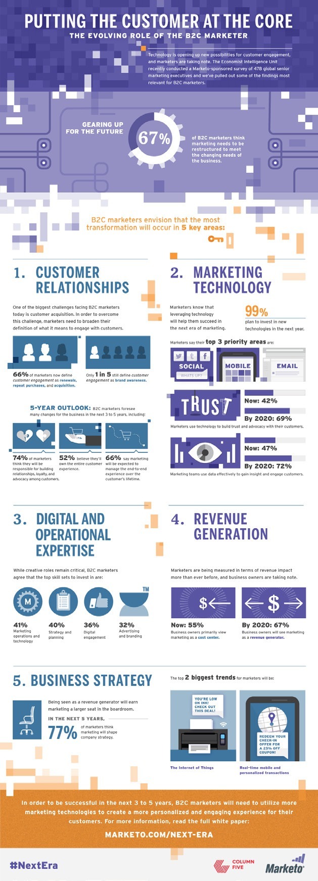
The results of an Economist Intelligence Unit survey, commissioned by Marketo, indicate that 99% of marketers plan to invest in marketing technologies in the next year. Here are other key findings: Impact on Revenue Of the B2C marketers surveyed, more than half (55%) feel that their marketing departments are regarded as little more than a Read More

Web Takes … July 2014 Picks

St. Joseph’s Hospital Health Center www.sjhsyr.org You could argue site visitors aren’t all that interested in home page banners that promote key services and special offers or events; they just want to find specific information. If that is the case, why not make the banners a direct reflection of the global links? This approach is Read More

Web Takes … June 2014 Picks

Willamette Valley Medical Center www.wvmcweb.com Not too far from Portland, OR, is the city of McMinnville, home of Willamette Valley Medical Center, an 88-bed facility. Maybe the personal, straightforward attitude commu­nicated on the organization’s website wouldn’t work in a big city, but it certainly caught my attention. The positioning statement next to its logo says, Read More

Web Takes … May 2014 Picks

Athens Regional Health System – Wellness www.athenshealth.org Wellness is a hot topic as healthcare organizations transition to popula­tion health management and value-based payment. But even the best sites continue to just integrate well­ness information with health infor­mation, health resources, or health library sections. Such is not the case for this website for a Georgia pro­vider. Read More

Web Takes … April 2014 Picks

Centegra HealthSystem www.centegra.org This beautifully designed site for an Illinois system has great navigation. There are lots of little touches that make the site stand out. Will consumers use a hospital that doesn’t take their health insurance? Almost never. But many hospital websites fail to indicate to visitors what insurance plans are accepted. Such is Read More

Web Takes … March 2014 Picks

Grady Health System www.gradyhealth.org If you have seen the movie “Nebraska,” you know about the power of black-and-white visuals. A similar and effective approach is taken with this site for an Atlanta-based system. The home page ban­ner rotates photos of five individuals and a family, shown in black and white, each with a simple message Read More

Web Takes … February 2014 Picks

Nash Health Care www.nhcs.org There is nothing subtle about this site for a North Carolina provider. It generally doesn’t follow conven­tional navigation, and everything seems to be in the viewer’s face. But the site grabs attention to draw visi­tors in and forces them to pay atten­tion. The home page – in fact, numerous pages – Read More

Web Takes … January 2014 Picks

Texas Health Resources – Well-Being www.texashealth.org/well-being Organizations increasingly promote community health, although those efforts usually focus on disease prevention and identification/treatment. This special section takes on the broad and important area of overall well-being, and tackles the job nicely. The site consists of two parts. One part addresses the dimensions of well-being: healthy behaviors, emo­tional Read More

Web Takes … December 2013 Picks

Virtual Tours Checking out healthcare facilities in person is difficult and at best limited. Virtual tours fill this important role and have the advantage of providing details that a tour guide might not give. The three reviewed organizations all offer virtual tours that provide full-screen viewing, 360-degree rotation with click and drag, a zoom func­tion, Read More

Web Takes … November 2013 Picks

Gundersen Health System Provider websites have come a long way since I started reviewing them 14 years ago. But with some excep­tions, interactive functions remain underutilized. This site for a Wisconsin system is one of those exceptions. A click on the Health & Wellness link brings visitors to a page where they can access numerous Read More

Web Takes … October 2013 Picks

In this issue we review three hospital sites: DMC Surgery Hospital Coping Club at Kosair Children’s Hospital Onlife Health DMC Surgery Hospital It’s been two years since I visited this site for a suburban Detroit fa­cility. Some changes have been made – some good and some not so good, depending on your perspec­tive. Nevertheless, the Read More

Web Takes … September 2013 Picks

Children’s Hospital of Pittsburgh of UPMC www.chp.edu This site reflects a growing trend in hospital websites – simplicity. The home page features a strong visual image in the banner area, a half-dozen global links that can be ex­panded to give access to virtually anything a site visitor might want to find, and a highly visible Read More

Web Takes … August 2013 Picks

Hartford Hospital www.harthosp.org It has been a dozen years since this site was reviewed. The site for this Connecticut institution was out­standing back then, and with changes over the years, it is out­standing today. Most hospital sites fail to identify the organization’s key service lines. Yes, many sites will highlight a few serv­ices in their Read More

Web Takes … July 2013 Picks

Alamance Regional Medical Center www.armc.com This unusually designed site for a Burlington, NC, hospital is a real pleasure to visit. Except for a dark green background at the top of pages, the background is gray. Layered on top of the gray are multi­colored navigational links on the left. Colorful blocks that promote key features seemingly Read More

Web Takes … June 2013 Picks

Holy Family Memorial www.hfmhealth.org As the largest provider of healthcare services in Manitowoc County, Wisconsin, Holy Family Memorial has a lot to offer area residents, and that is clearly reflected by its website. Areas of the site that are particularly noteworthy are: Outstanding quality section. The information offered is not as comprehensive as found on Read More

Web Takes … May 2013 Picks

Indiana University Health www.iuhealth.org Most hospital and health system websites cover a huge array of topics on their home page. But this site takes a laser approach, placing great focus on what the organization thinks are the major reasons for someone visiting the site and sub­jects important to the health system. The home page is Read More

Web Takes … April 2013 Picks

Methodist Healthcare www.sahealth.com Serving the San Antonio, TX, mar­ket, Methodist Healthcare has a website that excels in almost every aspect. Site visitors will immediately note the strong home page focus on health and wellness information. Right below a large banner that rotates key service-line messages is another large section called San Antonio’s Health Information Resource. Read More